This 4-room Flat Blends Raw And Retro Together Perfectly
Interior Design & Decor3 minutes read
7503 views
7503 views
Glen and Brenda are the proud owners of this 4-room flat located at Compassvale Crescent. Preferring a classic look, both homeowners naturally gravitated towards monochromatic choices during the renovation process. Together with Kevin from H2O Interior Renovation, they worked on perfecting the aesthetics and injecting a dash of colour.
Covering All The Bases
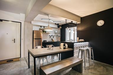
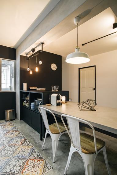
A retro-industrial hybrid, the couple’s kitchen is a result of meticulous planning on Kevin’s part, and each aspect taken into serious consideration before execution. Walls were hacked to create an open concept, leaving only a bar counter to act as divider.
Ventilation blocks were added on one side of the counter for a more old-school feel, and a portion of the kitchen floor ended up being tiled so food won’t stain the concrete.
A Reason For Everything
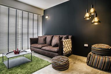
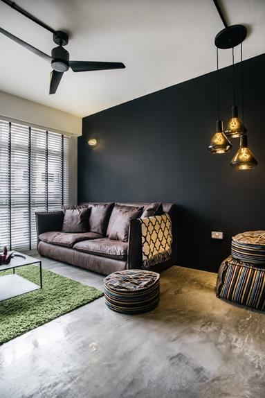
Glen and Brenda purchased their living room furniture without an exact vision in mind. They simply went with the flow and bought each piece separately. Concrete ideas only started snowballing after the couple found their ideal sofa.
“Since the sofa was dark coloured and huge, we felt the need to find a coffee table that was thinner and lighter looking. Our TV console had to fit the television, so we had to search for one that wasn’t too small. The poufs were added in for extra seating, and the carpet is there to break up the monotony of the grey flooring.”
The brightest piece of the bunch—their green carpet—was an amazing steal from IKEA. The moment Glen and Brenda caught sight of it they knew it would provide a much needed splash of colour.
Overcoming Obstacles
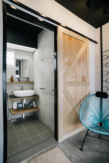
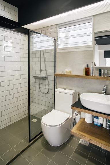
Since the bathroom contained a limited amount of space, it was impossible to install a door that would swing inwards. Kevin suggested a barn-inspired sliding door to counter the issue. To keep the bathroom’s décor consistent with the rest of the house, its insides mainly feature a monochromatic palette.
A Singaporean Flavour
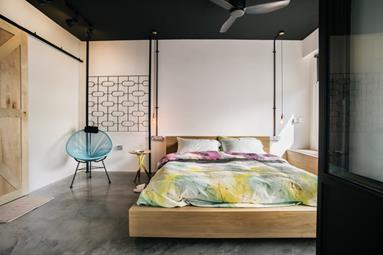
The focal point of the master suite? A retro chair and an old-school grilled panel. The bedroom was designed to be a representation of the couple and their roots, with old buildings located at places like Tiong Bahru and Geylang used as inspiration.
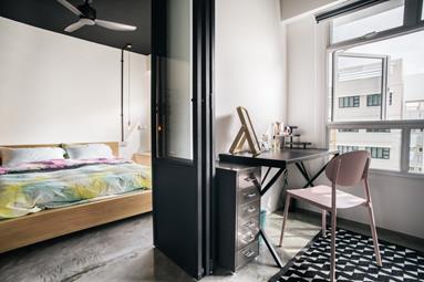
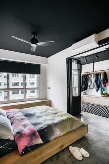
Kevin also added a folding door in the middle, separating the entire room into two and providing flexibility for the couple. On the other side sits their wardrobe, which has been designed to resemble a clothing shop.
“The bedroom is our favourite area within our home. Just like the living room and kitchen, we wanted a create large, open space, and Kevin really helped us achieve that.”
Request for quotes and we'll match you with a selection of Interior Designers!
Previous
Here's How You Can Make Ironing An Easier Process


 Sign Up with Google

.jpg)
