Nothing Straightforward About This BTO Flat In Sengkang
Interior Design & Decor3 minutes read
20267 views
20267 views
Gleaming white and spacious to a fault, the five-room BTO flat of parents Kenny and Serene could easily be mistaken for a luxe condominium apartment. Indeed, that’s the surprise that the couple wanted to pull out of their hats when they approached NID Design Studio. The solution? Tearing down design conventions to make way for a bold experiment in geometry. The results are stunning.
Out of line
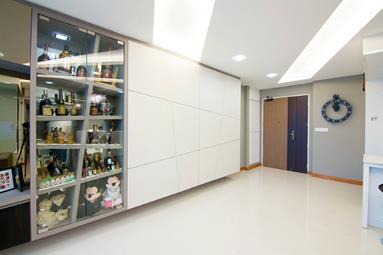
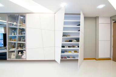
Greeting guests at the entrance is this unique storage and showcase cabinet. Here, a cheeky play of slanted lines creates a head-turning façade that’s sure to be a conversation starter. The laws of symmetry are broken again in the busy false ceiling that seems to explode across the living room. Of course, everyone has favourites. Serene awards the medal to her ceiling, citing its “unconventional yet stylish” look.
Sharing space
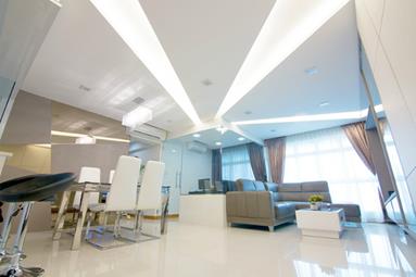
The study room wasn’t part of the couple’s Sengkang flat’s original floor plan, but Kenny felt that the living room could accommodate one without compromising the airiness of the home. To aid the look, glass panels were used to separate it from the living room. Apart from letting light flow freely between the two areas, the transparent walls allow Kenny to keep a lookout for his two young children while he works.
On the chopping block
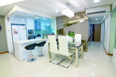
While the missus adores the ceiling, Kenny counts this bar table as the standout feature. It was chopped from the pre-existing kitchen, but Kenny has no regrets. After all, this is where he slings beer and mixes drinks for his friends when they come over. He had also hoped to include a hanging glass rack for his wine bottles, but was forced to scrap the idea due to time constraints. “Maybe … in the near future,” he laughs.
Light it up
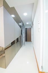
With details closing in on the space faster than a running tap overflowing a Yakult bottle, keeping it sufficiently lit became doubly important. This was to ensure that the home doesn’t appear crowded. Thankfully, the mostly white interior already gets half the job done. It’s punctuated with wood accents and artificial flora, which help the place avoid feeling too sterile. Elsewhere, mirror panels and transparent furniture keep the light bouncing boundlessly.
Looking for more inspiration? Check out more styles here or head over to our Reno T-blog chat to be enamoured with the renovation journeys of our forum members.
Request for quotes and we'll match you with a selection of Interior Designers!
Previous
5 Charming Old-School Cafes to Hang Out At


 Sign Up with Google

.jpg)