A Bright Scandinavian Renovation Project at SkyTerrace @ Dawson
Interior Design & Decor4 minutes read
6541 views
6541 views
This is a story that starts even before the renovation journey. A self-professed Ms. Perfectionist, Fion had a hard time finding a designer who was able to materialise her thoughts. “I created a mood board and brought it to various firms to see if they could achieve the exact look I wanted. Most had problems with certain things, but after a tedious process of hunting, I managed to find Samuel and Kef from Unity Interior Design. Their impressive concept won me over from the get-go!” she says gleefully.
Happy Snaps
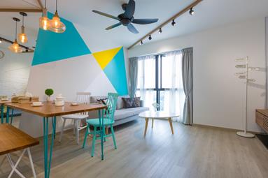
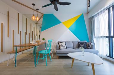
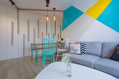
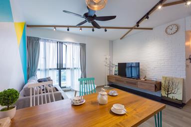
Bright, geometric shapes fill the living room’s wall, and are easily things one’s eyes would land on when they enter the flat. “Fion loves the wall so much, she uses it as a backdrop to take photos,” Kevin teases his wife. But she proudly admits it, and adds that when they have friends over, they too would use it for ‘wefies’ because of its striking design.
However, it’s not just the wall that’s attention-grabbing. Wooden lines extend to the ceiling and create crisscross patterns that leave a significant, visual impact. Kef explains, “To enhance the effect on the ceiling, I added strips on the storage cardboards. They are great for serving two purposes – completing the look and doubling as door handles.”
When the interior professional first presented his drawing to the couple, they were amazed at how he could take what they had in mind, and elevate it to a higher level. Fion wanted the living room to have a cheery atmosphere that wasn’t too ‘in-your-face’, which Samuel and Kef did a superb job of delivering.
Kitchen Vision
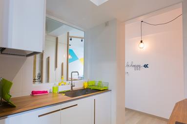
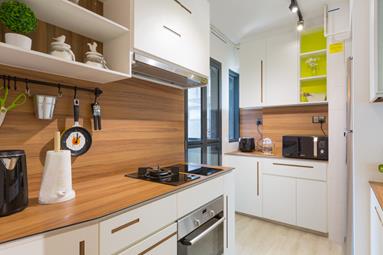
Kevin pointed out something most wives would be delighted to hear. “The kitchen is my favourite part of the renovation because even for a small area, it still manages to look inviting,” he says, referring to the distinctive shades and décor elements used.
Inspired by an iconic French architect, Kef expresses, “I got the idea of multicoloured structures and shapes from the late Charlotte Perriand, who was famous for this particular style in her heyday. I incorporated her concept into the kitchen cabinets, and it resulted in a livelier design.” Giving two thumbs up to the dash of colours, the pair added that this is something they would have overlooked, so they were really glad to have Kef’s input.
Other than the upbeat addition, Kef also suggested a practical feature in the kitchen. “He built air vents at the side to allow better ventilation, which didn’t even cross my mind previously. I really like how Kef paid attention to these little things because it shows that he really thought about our needs,” Fion says gratefully. Like many others, the combination of functionality and aesthetics is what most homeowners look for.
Spaces For Two
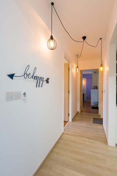
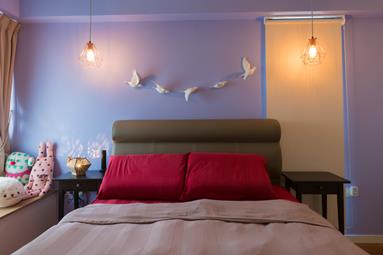
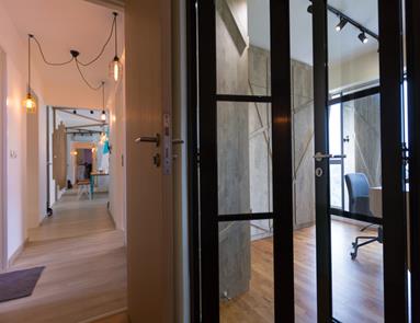
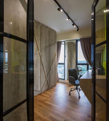
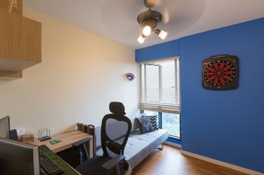
When the couple isn’t relaxing side by side, they can sometimes be found in their own enclaves. While Kevin likes playing games on the computer, Fion enjoys watching Korean dramas on hers.
“I like everything to be perfect, down to the shades of brown and differing textures of the furniture, so I was really happy when Kef managed to tie everything together. Even the French door fits at a diagonal angle!” Fion comments on her own room. It wasn’t an easy task finding a designer who could do it though.
What you’re looking at used to be the corner of two walls, which is an area many would never think of hacking away, but Kef took up the challenge. It resulted in a unique entryway that stands at the end of their master bedroom. Fion gushes, “Plus, the people from Unity were so patient with me. I had a hard time choosing between the different types of laminates, and they really helped by providing sound suggestions and designs.”
Renovation project by Unity ID
Click here to see more.
Request for quotes and we'll match you with a selection of Interior Designers!
Previous
2017 New Year's Resolutions For The Home You Must Follow


 Sign Up with Google
.jpg)