Stylish Space - Big On Style
Interior Design & Decor4 minutes read
45492 views
45492 views
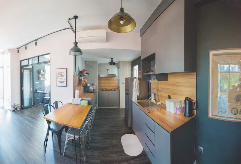
A little over 500 square feet, Greg’s apartment appears cavernous despite his penchant for somber shades. After all, the science of space dictates that lighter colours should be employed in small spaces. Nonetheless, it wouldn’t have been possible if not for his incredible restraint to keep extraneous details to a minimum and to rein back on over-designing. We speak to the bachelor on renovating, decorating and making the best out of a tight space.
Project
560 sqf one-bedroom apartment
Duration
Over three months
Owner
Greg Lee, Medical Director
Define your apartment’s style.
It’s fashioned after an open-plan modern industrial loft. I wanted it to look masculine and structured, yet cosy. This is why I opted for basic black, grey and teak. The subtle nuances of tones and textures keep my place visually arresting, without going overboard. Plus, I rather love metallic elements, so you can find a lot of that in my interior.
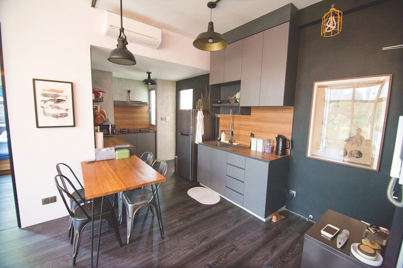
“Edison bulbs exude a warm luminescence, and they go well with industrial-style lighting like pendant and caged lights. They’re also really easy to maintain.”
What was the state of the previous interior like? Did it affect your renovation journey?
The place is over ten years old, and it was used as a showflat for the estate’s development. It was in good shape, but it just needed a bit of an update.
Renovations were not affected by the state of my apartment. However, I had zero design experience, so my journey was fraught with unforeseen circumstances such as leaking water pipes and damaged gas pipes! While some of my initial designs didn’t quite work out, the project turned out well.
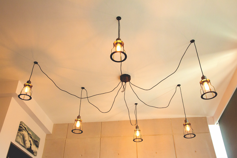
This luminary infuses a cosy cocoon-like ambience in the living room.
Could you share some of your lessons learnt with fellow homeowners looking to renovate their home?
1) Have a strong vision of how you would like your place to look, and look for a good contractor who can execute this.
2) Keep to a strict budget! There are a lot of temptations to add unnecessary frills along the way.
3) Save up on one or two expensive furniture that you really want. Think of them as investment pieces.
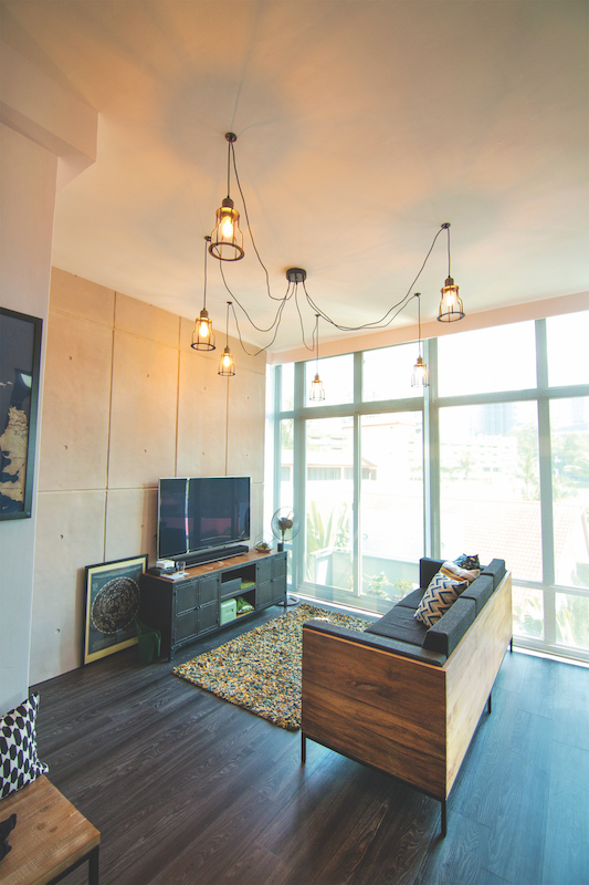
“My style mostly reflects my utilitarian nature in wanting to keep things as edited as possible. Out of all design aesthetics, industrial is the most utilitarian because of the repurposing of old or discarded objects, and making them useful again. “
Which part of your home is your favourite?
All of it! All my sweat went into it. But if I had to choose, I’d say the concrete wall panels in the living room. They cement the industrial look for my pad.
What’s the hardest part about renovating a small space?
Over-designing. Everything needs to be edited with a strong focus on key details. In addition, the urge to acquire many décor pieces has to be curbed so the space won’t look cluttered.
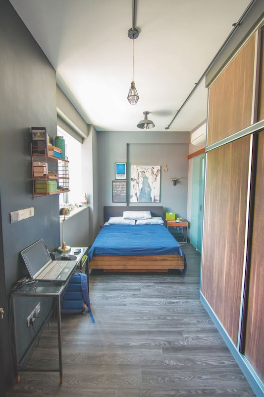
Any tips on space-planning and designing a tiny interior?
- Keep the design consistent for each room so that it seems like one continuous area.
- Carve out individual sections to cater to different functions by portioning the room with furniture instead of walls.
- Simplify by throwing out as much unnecessary items as possible. No hoarding!
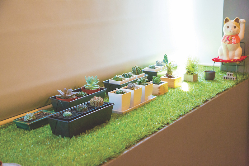
Due to the lack of a balcony, Greg reconstructed the planter at his bedroom window to look like one. It’s his personal mini garden with a collection of cacti, succulents and bonsai.
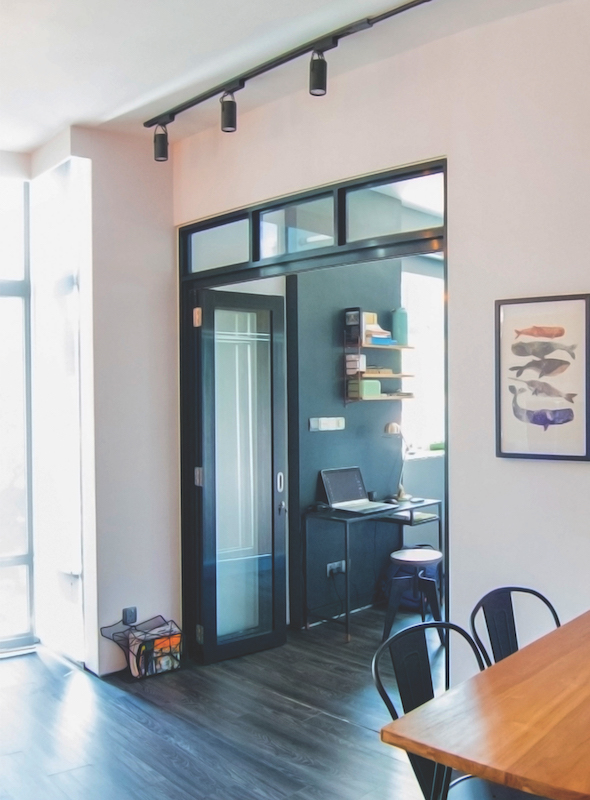
His bedroom’s doorframe was hacked and replaced with black-framed glass doors to welcome the open-plan concept that Greg wished for.
Request for quotes and we'll match you with a selection of Interior Designers!
Previous
RenoDiary - Careful Considerations


 Sign Up with Google

.jpg)