RenoDiary - Careful Considerations
Interior Design & Decor5 minutes read
50185 views
50185 views
Creativity and skilful planning comes together to ensure every inch of this apartment is put to good use. Think spacious open spaces decked with full-length windows and purposely fitted sans doors. This was the very vignette that greeted new homeowners, Victor and Eunice, on their first visit to the resale flat – and they both knew they had to have it. It might seem like a bit of a paradox but even though the pair loved the freedom of space, they still wanted to restore order and demarcate the zones that meld into one another too easily.
Who lives here
Victor, a manager in his early 30s and his wife, a civil servant in her late 20s
Home
Four-room executive apartment in Sengkang
Floor area
1350 sqf
Renovation cost
Approximately $60k
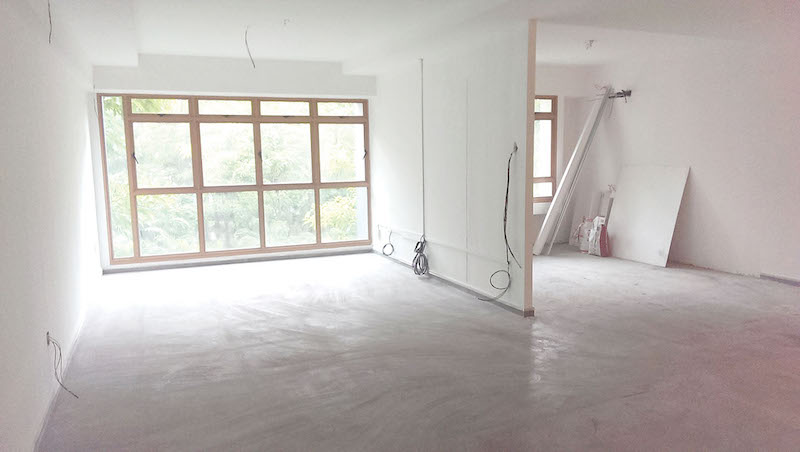
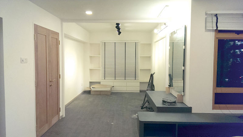
“The previous owners employed an open-plan concept. But the bare walls, pale homogenous tiles, and lack of doors in the study and kitchen appeared too stark, as the couple wanted a warm and inviting haven to come home to,” says Jimmy Tan from 3D Innovations, the interior designer in charge of refurbishing Victor and Eunice’s personal living quarters. “Nevertheless, they wanted to preserve the openness as much as possible, so a careful configuration of the space is essential from the very start,” he continues.
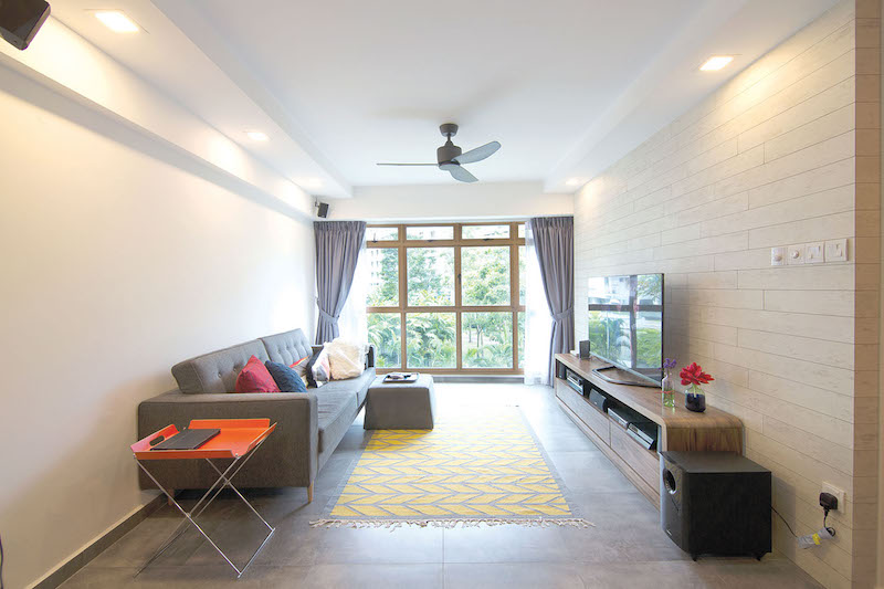
“I wanted to break away from convention and try something new. The wall feature is actually crafted from plywood laminates that were cut into thin strips and laid in a brick-wall pattern. It also keeps wires and LAN lines well out of view.”
Space Savvy
Jimmy’s ingenious suggestion to partially hack the wall on one side of the study to make way for the dining area was met with resounding consent. “We didn’t mind reducing the size of our study because this means there will be a new zone created,” remarks Victor. The interior designer also fixed black-framed glass doors and walls, so the internal spaces are connected despite being demarcated. This way, the dining area will also be privy to sunlight that seeps in from the study’s windows.
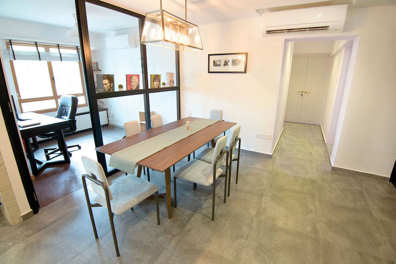
WE LOVE: Instead of going for chandeliers, the couple chose this unique industrial-style lighting to illuminate their dining area.
STYLE IDEA: “The concrete-inspired flooring is probably one of our best decisions yet. Eunice and I were attracted by the raw look of cement screed, but we were also afraid to pull the trigger as we were aware that it came with its own set of maintenance issues such as the possibility of powdery floors, cracks, as well as the need to apply sealant frequently.”
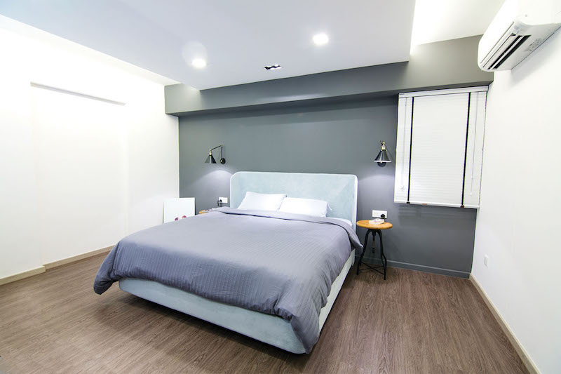
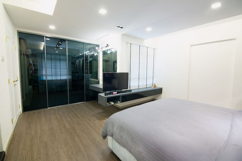
Likewise, the home dwellers requested their master bedroom and walk-in wardrobe to merge as one. With the partition that separated these two rooms removed, space is amplified. “We love space, and we did not want to live in a cramped bedroom,” pipes up Eunice. With a personalised atelier for their apparels, more than ample walking space and a plush King-sized bed, it is of no surprise that their private sanctuary is the couple’s favourite room.
Creative Ingenuity
You know it’s exceptional design when the artisanship doesn’t disclose its secondary purpose. Take, for example, the false ceiling that runs from the living room to the master bedroom. Apart from brightening the interior with its built-in cove and down lights, this structure also conceals unsightly air-con trunking to keep the space looking seamless.
The living area also sports a custom-made storage system that allows the couple easy access to either their morning coffee or tipple of choice. The measurements done for this unit wasn’t arbitrary, but carefully considered to allow the kitchen’s accordion doors to lie flat against its sides when folded open.
Jimmy also designed the couple’s shower area such that the unappealing pipes are kept hidden, while nooks are provided to hold the duo’s bottles of toiletries.
HOMEOWNER'S TIP: “The renovation process will never be hassle-free. On that note, you ameliorate the situation by getting a reliable interior designer who listens attentively to your needs and wants, manages his team well, and is able to deliver as promised. It helps if you do prior research and planning, or read up on other people’s experience on the process. We did our homework on RenoTalk’s T-blog forums – and it made our journey a lot less difficult.”
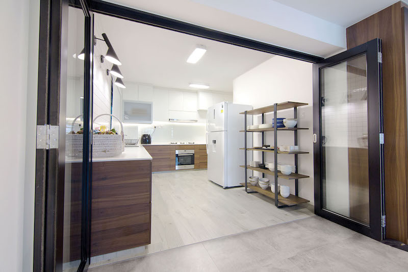
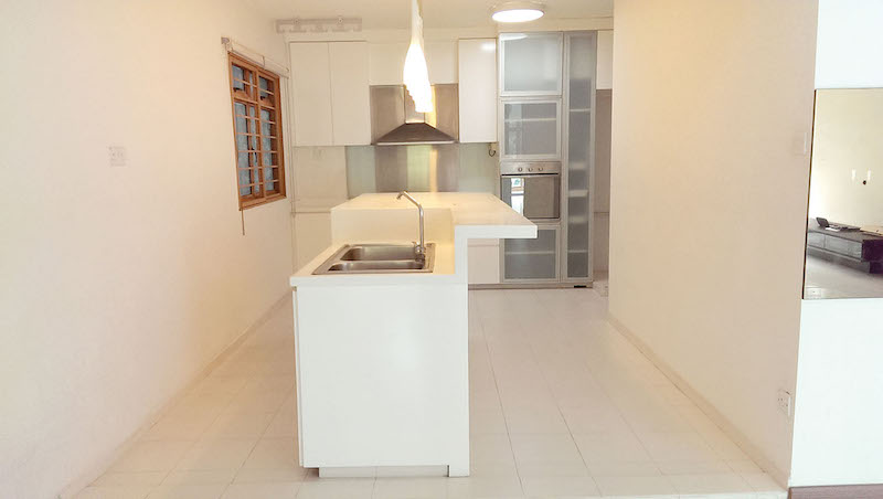
“The kitchen island that was installed by the previous owners was bulky and impractical. We chose to have that hacked away and fitted our kitchen with cabinets to store our provisions.”
A Balancing Act
This is a classic example of making it work especially when you combine two individuals with personal preferences that stem from opposite ends of the spectrum. Victor’s favoured palette of black, white and grey form the foundation for their home, while Eunice’s preferred pretty pops of colours appear on their furnishings and showcase pieces.
“Instead of somber black, I chose a refreshing shade of blue for the vintage sewing machine legs. This hue is also echoed on our dining chairs and wing bed frame, and it complements the dark tone the interior is swathed in, ” she says.
Rather than feeling too masculine, the dusky palette that Victor prefers gets a refreshing boost thanks to the bright swatches of colour that punctuate their abode.
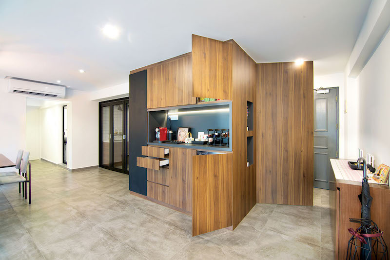
This custom-made cabinetry clad in decadent dark wood keeps the couple’s possessions hidden but within reach, while the panel near the entrance hides the unwieldy door and handle of the home’s bomb shelter.
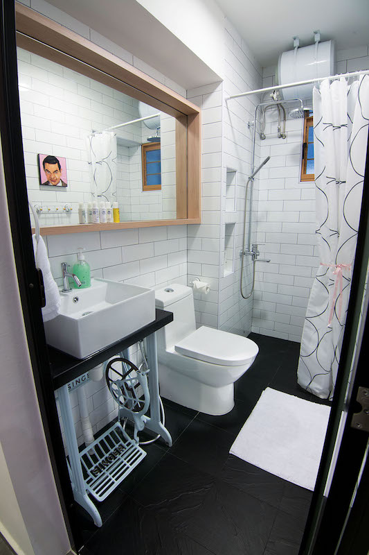
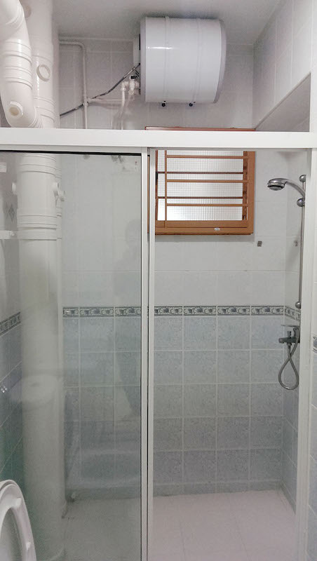
The sewing machine legs are purely ornamental. Mounting brackets hold up the basin and countertop, to allow Victor and Eunice the ease to set aside the legs when they need to clean the floor or carry out plumbing works.
Request for quotes and we'll match you with a selection of Interior Designers!
Previous
Stylish Space - Lofty Ideals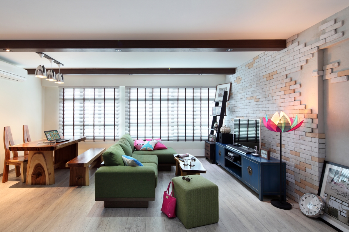


 Sign Up with Google

.jpg)