Four Things Home Design Can Learn From Web Design
Interior Design & Decor5 minutes read
2587 views
2587 views
(Guest Writer: Robert Thompson)
At first glance, home design and web design don’t have much in common. Home design is all about having everything in its right place. You want your front room to be warm and inviting, your kitchen to be clean and easy to navigate, and your bedroom to be a place of quiet contemplation.
Web design feels more like a marketing exercise, where every aspect of the site is geared towards driving visitors down a funnel - either to buy whatever it is that you’re selling, or to read the content you really want them to pick up on.
Despite that, there are certain elements that web design and home design have in common. Aesthetics are the most important aspect in both types of design, as is having a clear strategy for what should go where. There are a few things that home design can learn from web design, and we’ve grouped them all together in this handy article.
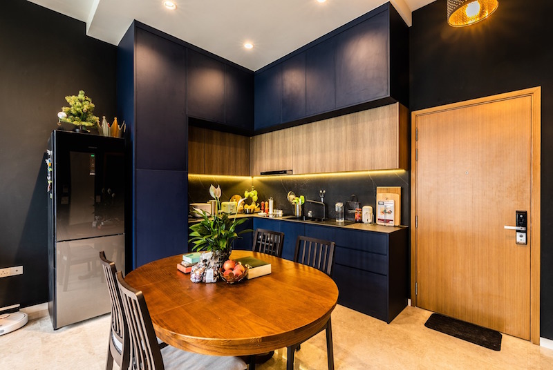
Image © ExQsite Interior Design
1. Keep Clutter Out Of Important Places
Have you ever walked into a room in someone’s house, and wondered what the room is supposed to be? If there’s a bed in the room, but also bookcases and a table, is it supposed to be a spare bedroom or a study? If there’s a television as well as an oven, is it supposed to be a kitchen or a lounge? There are many modern designers who seem to enjoy combining several purposes into one room, but the approach can lead to a confusing atmosphere for visitors - and even for you!
One of the most common tips you’ll see when it comes to preparing your home for sale is to keep unnecessary clutter out of rooms, so buyers can visualize the room the way they want to see it. 'Clutter' doesn't always mean trash, or excess storage. Clutter can mean objects that should, by rights, be in a different room.
Consider the way that a good website divides up its content. When you log onto the homepage of the BBC, you’re presented with a list of options across the top of the page. One option will take you to news headlines. Another will take you to sport, or to weather, or to entertainment news. You wouldn’t expect to click on sport, and see a story about the US election. If you clicked on the weather, you don’t expect to be sidetracked by music news.
In the same way, you shouldn’t walk into a home and find a microwave in the lounge area, or a washing machine in the bathroom. Make sure the items and furniture in a room belong there, and not somewhere else.
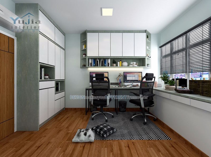
Image © Yujia Interior Design
2. Uniformity Of Purpose
All rooms in a home have a reason to exist, from the garage to the bathroom. If you want to watch television, you likely have a room in your house where the television is the focal point. The bathroom is called the bathroom for a reason, and it probably doesn’t have anything in there in terms of furniture that isn’t related to washing or grooming! Where people - and designers - tend to let themselves down with this is the bedroom.
We live in a time where sleep disorders are reported to be on the rise, and people find it increasingly difficult to 'switch off' and get a good night's sleep. We sometimes don't help ourselves by giving the bedroom other points of focus. Think about how mobile slots websites lay out its casino games. When you log onto the website, you'll likely be presented with a list of their best Mobile Slots, and nothing else that would distract you away from them. If there were 'about us' or similar information on that page, it would risk diverting your attention away from what the mobile slot casino wants you to see.
The focus of your bedroom should be sleep. Having a television in the room encourages you to stay awake, and lose focus on allowing yourself the rest you need. Having other entertainment facilities in the room does exactly the same thing.
Consider having a specialized entertainment room instead. When you go to the bedroom, everything about it should be tranquil, and designed to help you to drift off.
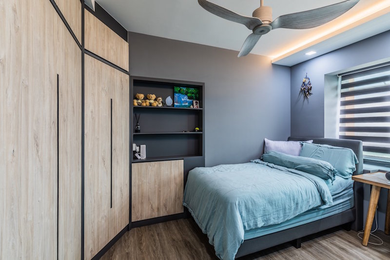
Image © ExQsite Interior Design
3. Consistency of Colour
Making poor decisions when it comes to the colour palette is one of the worst offences you can commit when it comes to design, be that web design or home design. There are pages out there on the internet which are devoted to ridiculing people who get their colour schemes wrong, and you’d be embarrassed to end up on one of you owned a website. Imagine there were similar pages which showcased the worst colour schemes in homes. Would your property make the list? If so, do something about it.
Often, poor colour design creeps in when people treat each room in their house as a separate design objective, rather than a cohesive whole. Whether you’re trying to sell a property or designing it from scratch, think about the journey that a person goes on when they walk through your front door, and then move on to other rooms in your house.
No single room should have such contrasting colours that it doesn’t appear to belong to the same building as the room next to it. Adjusting a few colours is fine, but try to have a theme which you can play with, rather than a clashing set of styles.
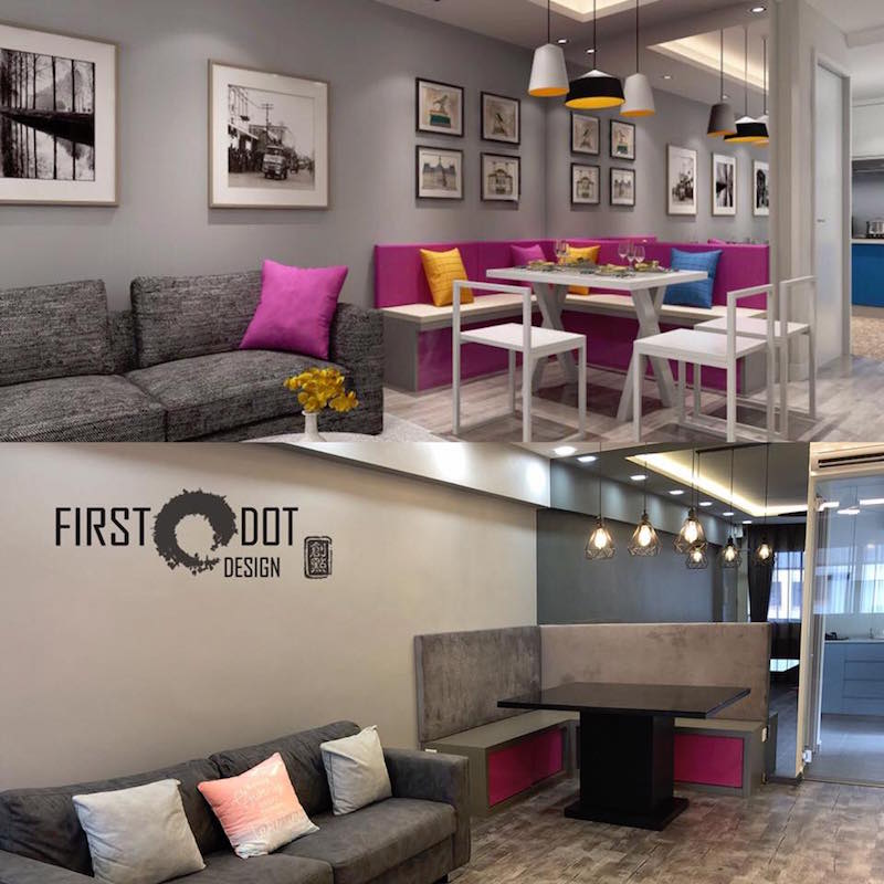
Image © First Dot Design
4. A Warm Welcome
Going back to the idea of a visitor walking into your house for the first time, the first impression they get will count for everything. Your kitchen might be beautiful, but if your hallway isn't, you've already let yourself down before your visitor gets a chance to see it. It can also affect your own mood. After a long day at work, walking through your front door should give you an instant lift. Once the door is closed, you should feel welcome and relaxed. A busy, noisy hallway or first room won't achieve that.
Of all the pages on a website, the homepage is the one that designers spend the most time on. They know that even if their 'products' page has the greatest look and functionality in the world, most people won't click through and look at it if the webpage doesn't immediately engage them and make them feel glad they found the website.
While you might feel that your next big home design project ought to be new work surfaces in the kitchen, or a new set of sofas and chairs for your lounge, chances are the hallway needs some attention first. You'd be surprised as to how much a revitalized hallway can lift the whole mood of your house.
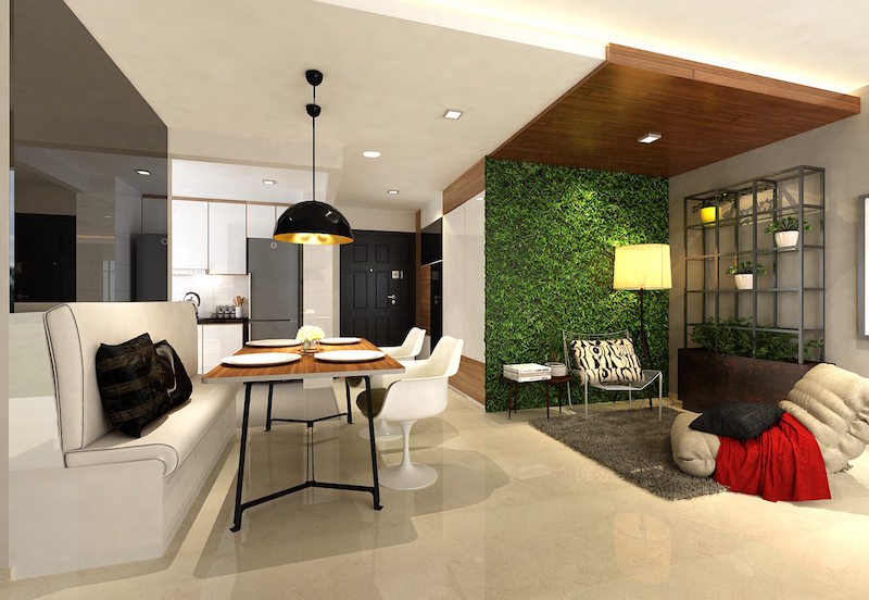
Image © Eight Design Pte Ltd
Request for quotes and we'll match you with a selection of Interior Designers!
Previous
How Is Sleep Deprivation Affecting Your Everyday Life?


 Sign Up with Google

.jpg)
Very Creative and beautiful living place. Thanks for sharing your Creative ideas. This gives me a lot of new creative ideas. Keep posting more in the future. <a href="https://www.vibranthomes.co.in/">Interior Designers in Chennai</a>