6 Common Interior Design Mistakes and How to Fix Them
Interior Design & Decor5 minutes read
4354 views
4354 views
Interior design is an art and science of its own. While cultural preferences will always influence design styles to a degree, there are best design practices that everyone will agree on. However, many homeowners are not aware of what makes for good interior design, and are prone to making common mistakes. Here are 6 common interior design mistakes people make and how to fix them.
1. Curtains - the Wrong Height, the Wrong Type
Having curtains your home is a
classic way of transforming a bare, boring room into something grandeur.
Curtains also let you control the amount of natural sunlight going in.
But a few common oversights can
reduce its aesthetic effect.
First, don’t hang curtains too low as they can make rooms look much smaller than they are. High-hanging curtains help shift gazing eyes upward toward the ceiling. This gives a better sense of vertical space, thus making rooms look higher and bigger. (Cool Curtain Fabrics to Experiment With)
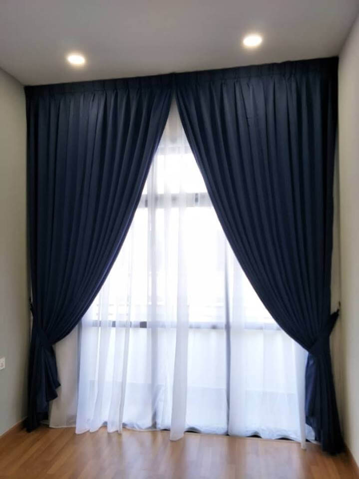
Design by JB Home Curtains
Next, don’t pick curtains with patterns that are too elaborate. Go for high-quality curtains in a uniform colour, which are easier to match with the rest of the room. Whites and blacks are typical choices, but it depends on what the overall colour scheme of the room is.
Curtains should be straight and tall – not a pile of mess on the floor. Aside from collecting dirt and grime, curtains that pile on the floor don't help make spaces look better!
2. Not Measuring before Purchasing Materials
Not measuring what you need before buying the materials you need can be a costly mistake – and a little due diligence can go a long way to save time and money.
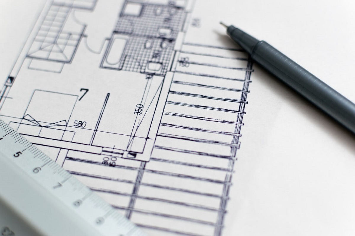
If you have the time, draw up a simple floor plan. Detailed floor plans are great because they allow you to re-evaluate your plans on the go. Plus, if an expert is available (say at the store) you can also present your plan to him or her for some advice.
It doesn't have to be complex, but a floor plan with correct measurements can help with materials purchasing.
Otherwise, taking notes on the dimensions you’ll need will suffice. Add them to your mobile phone if you have one or scribble them down onto a small notebook for convenience.
3. Placing Decorations at Wrong Height
Nobody is see your decorative pieces if they are too high or below eye level. Instead, place them at around 60 inches from the floor.
For a large and heavy piece, place it on a raised pedestal or platform to somewhere around eye level. How high should the pedestal be? Place the art piece next to the door and measure the space between it and the top of the door - this is the height you'll need.
_____________________
Follow the link to find an Interior Designer in Johor Bahru
_____________________
4.
Overdoing the Decorations in a Room
Don’t place too many decorative pieces in the same room. Instead, opt for a single large piece (such as a painting), or two or three if they’re smaller. Too many pieces will diminish the presence of the art pieces as observers shift their attention from one piece to another.
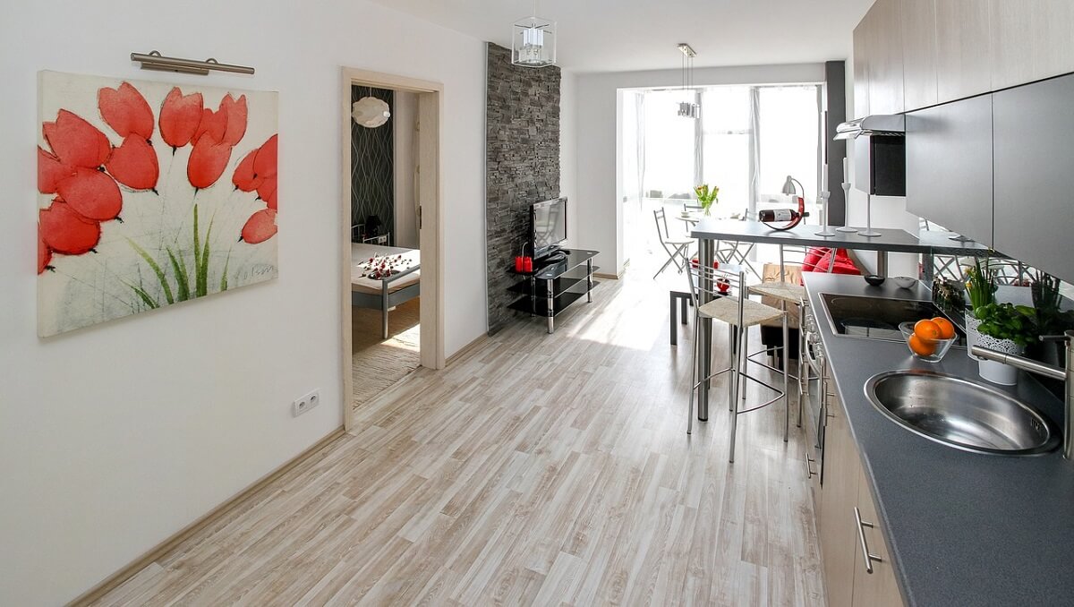
A single piece of art works best - don't clutter up a room with small and insignificant pieces.
5. Placing Furniture Too Close to Walls
It might seem like a good idea to place furniture and upholstery as close to the wall as possible to save space, but there are two big reasons why it’s not.
First, stains could form along the contact points between the wall and furniture due to dirt and grime build-up those contact points.
Second, placing furniture right up against walls not only looks awkward but also subtracts from the sense of spaciousness. In essence, placing a lone piece of furniture in the middle of the room maximises the feeling of space - in this case, to the point of desolation. The trick is finding the right balance.
6. Purchasing Mismatched Furniture
The final mistake that homeowners make is the use of mismatched furniture. Tempting as it is, letting cheap discounts dictate your furniture choices is a sure way to ruin the look of your interior design.
Choosing mismatched pieces of furniture will also unlikely meet the 60/30/10 colour percentage rule. Remember that a good colour scheme for any room should be composed of 60% of a single primary colour, 30% of a secondary colour and 10% for special accents. (7 Commonly Made Mistakes When Selecting Wall Colours, Choosing the Furniture for Your Home)
For variety and effect, you could designate (with matching furniture) a specific style to a room to make them unique.
_____________________
Find an Interior Designer in Johor Bahru
_____________________
Request for quotes and we'll match you with a selection of Interior Designers!
Previous
6 Items From Royal Selangor To Make Your Home Shine


 Sign Up with Google

.jpg)