5 Things We Love About This Waterfront Waves Home
Interior Design & Decor4 minutes read
4397 views
4397 views
One of the things we love to do most is gush about gorgeous home projects, and right now we can't seem to get enough of this renovation project at Waterfront Waves. And since there's too much to love about this space, we've listed our top five reasons why.
1. Larger Spaces
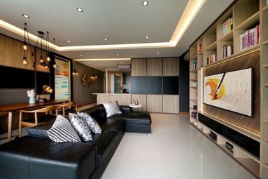
We love that the home owners opted to go without a coffee table, allowing the area to look and feel much more spacious. It's a smart move considering their living and dining quarters are linked, so piling too much furniture into the space may make it seem a little too cramped.
When you think about it, coffee tables aren't actually all that necessary, so by eliminating it it doesn't take anything away from the functionality of a home, but yet effectively makes it look that much larger.
2. Mixed Dining Chairs
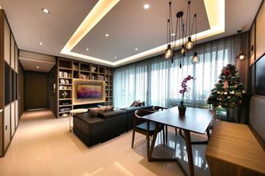
We always love when home owners mix and match, since it breaks the uniformity of things. It might not seem like such a huge element, but we adore how it shakes things up. Purchasing a variety of dining chairs seems to be a growing trend, people usually selecting them in similar shapes and sizes but of a totally different design.
This time though, these home owners have opted for two very different types of chairs; solo one seaters and also a longer wooden bench. It's a unique choice which brings out the dining area, and we're a hundred percent sold.
3. Personalized Wall Space
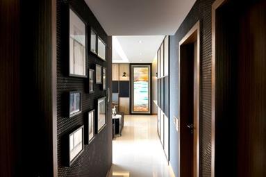
People usually leave less major areas, like corridors, free from decoration, since it's hardly likely they'll linger in these places. But if you noticed, these home owners have their corridors filled with pictures.
By adding these frames, they've made their home more personalized, even if the difference is pretty subtle. The patterned wall is a genius decision as well, since it allows the frames to pop. In the end, they've pretty much created a splendid and striking corridor.
4. Vanity Area
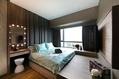
Their bedroom's a lovely cosy space, and we've got our eyes zoomed in on the vanity area. Their mirror, doused with bulbs, is a lovely touch to the space, as well as the vintage phone and modern stool perched below.
5. Kids' Room
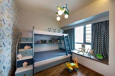
There are no limits when it comes to kids' bedrooms. It's a space to unleash your creativity and these home owners have definitely done that. Everything is loud, from the double decker bed to the feature wall, while even the curtains and lighting are unique.
And despite the amount of vivid elements in a single space, they're all tied together with a similar colour scheme so it works. It's a room that even as adults, we feel envious of the kids who will be occupying them.
Project by Starry Homestead Pte Ltd
Request for quotes and we'll match you with a selection of Interior Designers!
Previous
5 Super Simple Christmas Decorations Using Jars


 Sign Up with Google

.jpg)