4 Preschool Design Layout Ideas You Will Never Miss
5 minutes read
1784 views
1784 views
(Guest Contributor: Childcare Renovation)
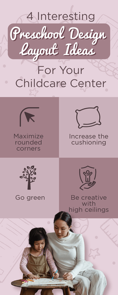
Let’s face it, designing the preschool layout is not easy. The childcare design layout does not have the same requirements as adults do. A preschool needs to consider the height of the overall interiors, colour usage, noise reduction options, and more.
Another important aspect in preschool design layout are the spaces available for the children to be active in, and a space that we call the ‘quiet zone’ for them to rest. We certainly don’t want to be containing multiple restless children in one room!
We have compiled 4 themes in a preschool design layout design that you can utilize for your interior design. Check them out!

1. Maximize Rounded Corners

Image © Canva
It is common knowledge that children are prone to accidents such as slips or falls.
You will definitely have to childproof your preschool design layout before allowing multiple kids to run about. One example of childproofing is using furniture or dividers with rounded corners instead of sharp edges.
This is to avoid unwanted situations such as when a child falls and knocks their heads against an object, resulting in bruises or worse, internal bleeding. That is the reason why preschool design layout should always be examined carefully.
Rounded corners are great because not only it is good for safety purposes, it is aesthetically pleasing for the preschool layout design too. Utilize circular furniture and curved dividers to create a soft and dreamy feel for the room, which can help calm children down after an active playtime.
2. Increase The Cushioning

Image © Canva
According to Kaplanco, the possible noise levels in the classroom should be taken into account when creating your preschool layout design idea. An effective way to reduce the noise in classrooms is to get cushioning.
No, cushions are not just meant for sofas, you can add soft platforms such as foam or carpets on the floor, foam-based wall decors, and more!
3. Go Green

Image © Canva
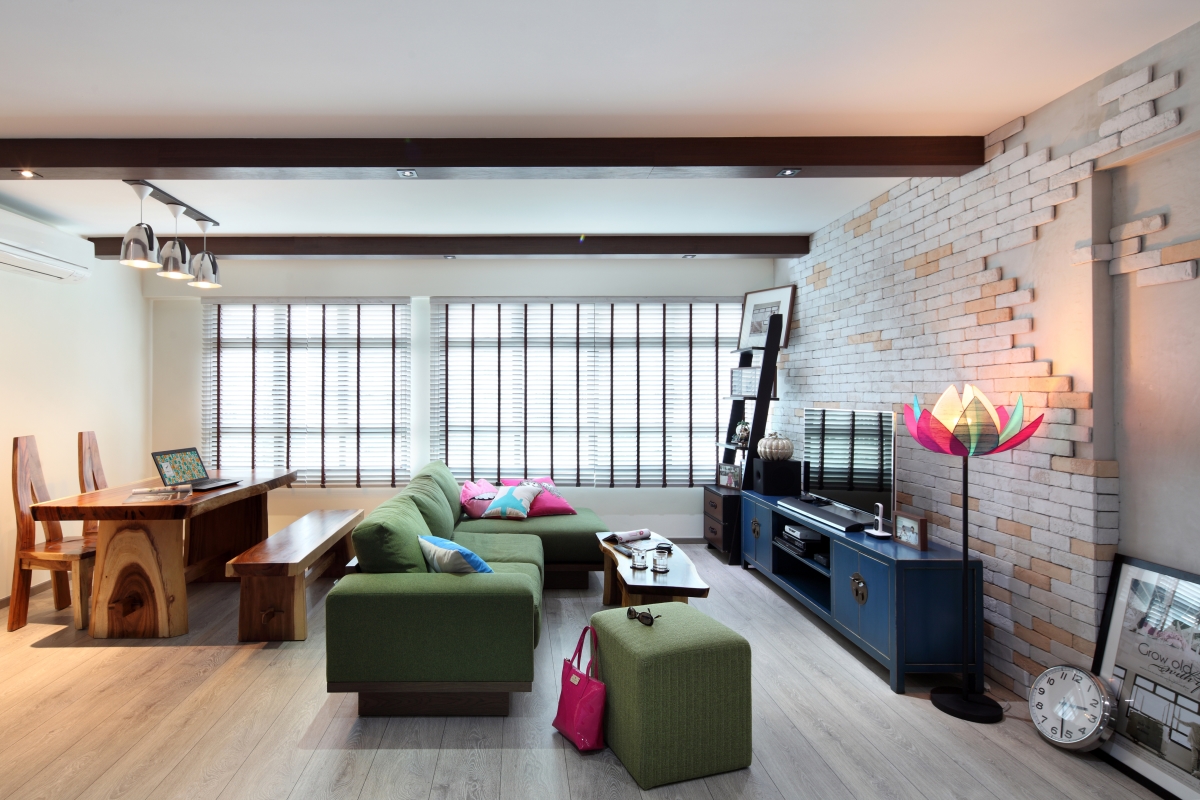
With the entire world going digital, more and more children are spending their time indoors and on gadgets, even for children as young as 5 years old. Their lack of time outdoors has had a negative impact on their mental development.
According to a review done in 2017 from the Journal of Pediatric Nursing, increasing access to green space for children had improved their mental well-being, overall health, and cognitive development.
Exposure to greenery also promotes attention restoration, memory, competence, social skills, self-discipline, moderates stress, improves behaviours and symptoms of Attention Deficit Hyperactivity Disorder (ADHD), and was even associated with higher standardized test scores.
4. Be Creative With High Ceilings

Image © Canva
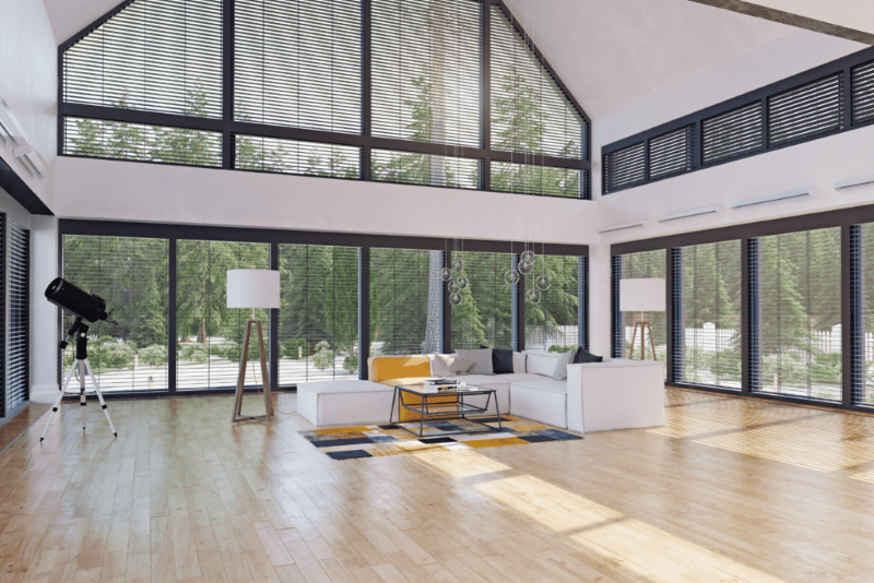
As mentioned in our previous article, we need to put height into consideration as children are not as tall as we are. Hence, everything must be placed fairly low. So what happens if you are only able to acquire a space with high ceilings? Should we just slap a decor on it and call it a day?
Nope!
There are so many things you can do to fully utilize your space for the layout design and set up a proper preschool space. You can add an indoor slide, hanging swing, netting, and more.
However, be mindful of safety and make sure to implement extra safety measures to decrease the risk of accidents. Professional help is highly advisable if you’re planning to incorporate a design layout idea for your preschool.
Conclusion
As you can see, doing design for a preschool layout requires creativity, knowledge in safety and regulations, resources, and more. These are just 4 among many other cool concepts that you can add to your layout design.
Childcare Renovation has been designing layouts for childcare centres in Singapore for 10 years with an amazing rep! Contact us now to get help with your childcare design!
Request for quotes and we'll match you with a selection of Interior Designers!
Previous
How To Create The Perfect Architecture Resume


 Sign Up with Google

.jpg)

