10 Tiny Design Tips That Will Enhance Your Home
Interior Design & Decor5 minutes read
3737 views
3737 views
Sometimes, when you find stunning inspirations for your home on the internet, you begin working enthusiastically on incorporating those elements into your dream home. At the end of it all though, the results fall short of your expectations. You don't quite know what to do or change to enhance its appearance, which will most probably leave you frustrated.
We have here 10 subtle interior hacks you could adopt in either the planning stages, or apply them after your initial set-up, when things are more or less done up and you already have a general gist of the finished product.
1. Wallpapering Unpredictable Places
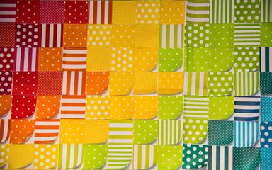
The general gist of wallpapering is to either have it cover a feature wall, or have it plastered on all four walls in the room. However, sometimes going against the norm gives your home a little more aesthetic edge, and you could start with where the wallpaper goes.
Cupboard doors are a great alternative when it comes to wallpapering, giving it a more unique quirk. adding vibrancy in the overall design of the room. Hallways are great spaces to wallpaper too, making the area feel much more lively, even if they're not used as much as actual rooms.
Our favourite though, is when wallpaper is used for ceilings. It makes the dynamics of a room much more interesting, and allows you to go a little crazier with the furniture, as opposed to if you had wallpapered the walls instead.
2. Avoid Repeats
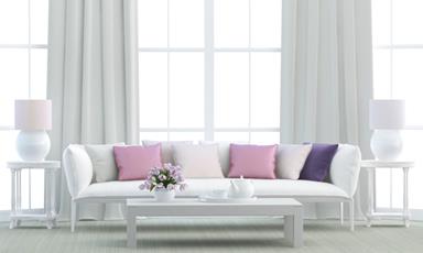
Purchasing items in exact pairs or sets are now a thing of the past, a cliche concept you should try to avoid. Some examples we can think of right off the bat which relate to these rules are fabrics and cushions.
People tend to purchase their sofa cushions in matching pairs, but what's trendier is having them mismatched instead. What's even better, is getting them in odd numbers. Buy cushions in numbers of threes of fives, depending on the size of your sofa, in varying colours or designs which compliment one another, and viola, you have a brilliantly modern sofa set.
Fabrics wise, always remember never to repeat them anywhere else in the house if you have already used it for a specific room. It makes your home look too uniform and tacky, even if the fabric you use is gorgeous. Ensuring the use of different fabrics in each area gives your home an overall more dynamic feel.
3. Invest In Art
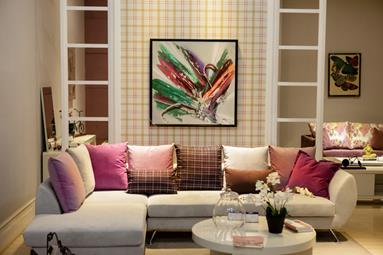
Art goes a long way when it comes to decorating. It's an expression of what both you and your home are about, and instantly gives your pad more character. Make sure to choose art pieces that go with one another in any given room, and don't go overboard as well. The last thing you want is an overly cluttered space, where the pieces will lose their focus.
If art seems like a pretty hefty option, you could use fabrics instead. They're vibrant and captivating, especially when properly chosen to match the vibes of your room. Purchase frames of your choice, then cut the fabrics accordingly before slotting them into these frames, and you now have a display item that works as well as any art piece.
4. Edit Your Selections
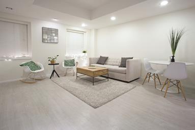
Relevant to the point mentioned above, you must remember to edit your selections before you make purchase. When it comes to buying art or other display sets, the excitement can cause you to grab more than you actually need.
The saying that less is more is most apt for this point, cramming too many display items, even if they're beautiful, will have an adverse effect instead. Thus, you should keep track of which items you wish to add to your shopping cart, and edit out some of the pieces which aren't necessary.
How do you tell if they're necessary? Ask yourself two questions. One, do you really love it? If there's even a hint of hesitation, then we'd say skip it. If you're not that in love with something you're going to buy now, a year or two down the road, when it feels even less current, you're probably bound to get sick of it.
Two, does it do anything for your home? Will adding the these display sets enhance the style of your home? Keep only those that will, while canceling those that won't off of your list.
5. Adjusting Furniture
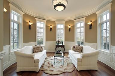
The first instinct people seem to have when it comes to furniture layout, is to line everything against a wall. What they don't realize is, this can make it look too rigid, and too much like a boring dance hall setting instead.
An interesting change you can make is to pull your furniture a little inward, even a few inches helps make a difference, creating a tighter and more cozy space. You may be worried your room will look like it has shrunk, but we assure you it gives the space a more lively and personal feel.
6. Cream Ceilings
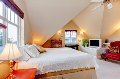
The go to colour for almost all ceilings is white, but there are actually subtle flaws present. There are hints of grey present in white, which in turn makes your ceiling look a little more gloomy than you'd wish.
The better option instead, is to paint your ceiling a cream shade, allowing it to look brighter and a little cheerier too, which does more for your room than you think.
7. Extra Fabric
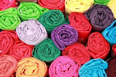
Imagine the amazing things you could do with fabric, from lining your dining tables, to D.I.Y curtains, to draping them on furniture or across the ceiling. And it isn't the cheapest to invest in, but we highly recommend you buy it in excess, than suffer when you realize there's not enough.
Even after taking detailed measurements and double checking them, we still recommend you purchase a little extra. How much extra though? We'd say about 70 inches should be a safe gauge to follow.
8. D.I.Y Lampshades
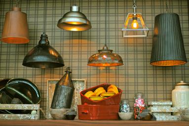
When you're out shopping for lighting, don't panic if you can't spot any lamps you particularly fancy. Getting something simple, whose functionality matches your requirements, is actually key.
The lampshade can be dealt with later, in numerous different and interesting ways. Work with exquisite looking fabrics, like Indian Saris or even intricate oriental prints, wrapping them around your lampshade. This immediately gives it a really distinct and attractive appearance.
Experiment with other materials as well, like chiffon, tulle, or even antique chinese papers, to create your very own lampshade design. If you're stuck or can't think up ideas, go online to source for gorgeous inspiration.
9. Bookshelves
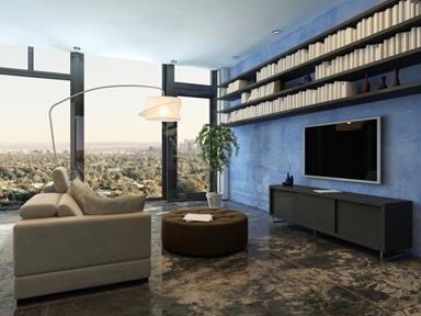
Open bookshelves are not only beautiful, they're also really convenient. There is one tiny rule to adhere to though, which is to never use a bookshelf to store anything other than books.
When open bookshelves are stacked with books, it's cluttered, but in a good, uniform kind of way. If you add anything else other than books on it though, even if it's a charming display piece, it breaks the spell of cohesion and creates messy chaos that isn't a pretty sight.
Therefore, make sure your bookshelves are solely about your books and nothing else.
10. Matte Parquet
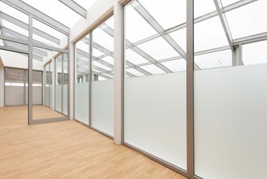
The last tip we have for you has to do with flooring. Parquet is frequently used in a lot of houses, and gone are the days where the glossier it is, the better. The trend right now is to keep things it as understated as possible.
Parquet with a matte finishing tones it down, giving it a more updated and current look, which makes your room look modern as well. The only downside is its low resistance to scratches, but that can be fixed with a little extra care.
Avoid dragging any furniture along the floors, if you have to shift them, carry them the whole way instead. If you have items like food trolleys or rollable chairs, place a carpet in the room, and try to roll these items only over the carpeted area.
It's the small things we tweak which eventually lead to big differences, and that's a theory we sometimes forget. So it's good to start making thorough plans, and adding even the smallest of details into them.
Request for quotes and we'll match you with a selection of Interior Designers!
Previous
All You Need To Know About Renovation Costs (Part 2)


 Sign Up with Google
.jpg)